
February 9, 2026 | Post By BROZ
Why Most Logos Fail (And How to Design One That Actually Works)
Every brand starts with a logo, but not every logo actually works. Many fail because they prioritize aesthetics over clarity, or they chase trends instead of solving a real business problem. The result is a mark that looks nice in a portfolio but doesn’t help people recognize or trust the brand. A successful logo should be a strategic tool, not just a pretty badge. In this post, you’ll learn why logos fail and how to design one that actually serves the business.
First, many logos fail because there’s no underlying strategy. A logo without clear purpose, audience, and differentiation is just decoration. When a design is detached from where the brand sits in the market, it cannot communicate a meaningful promise to customers. The fix is to start with brand strategy: define the audience, the brand’s core message, and how the logo will stand out among competitors. A strong strategy guides every design decision and prevents aimless creativity.
Second, designers often overemphasize trendy aesthetics. A logo should feel timeless, not like a snapshot of a moment. Trends fade, but a logo built on durable principles—clear shape, strong contrast, scalable details—stays legible across sizes and mediums. The antidote is to test designs against black-and-white, small sizes, and real-world contexts to ensure legibility remains intact when trends are stripped away.
Third, many logos are overcomplicated. Complex symbols or crowded typography hinder recognition and reproduction. A great logo finds a single, memorable idea and expresses it with simple shapes and a clean type treatment. The logo should be identifiable at a glance, even when reduced to a favicon or social avatar. Stripping to a simple core idea often reveals the logo’s real strength.
Fourth, underestimating versatility is a common misstep. Logos must work across a spectrum of applications: digital screens, print materials, merchandise, and edge cases like embossing or stitching. A logo designed only for one context will fail in others. Build flexibility into the design: scalable shapes, a robust color system, and alternate versions (black-and-white, single-color, and horizontal/vertical layouts) that preserve identity in every setting.
Fifth, color choices matter as much as shape. Poor color palettes can undermine contrast and legibility, especially on light or dark backgrounds. A strong logo uses a limited color set with high internal and external contrast. Test color reversals and ensure the mark remains distinct when color is removed entirely. The right palette supports recognition and reinforces the brand personality without overpowering the message.
Sixth, many logos lack a coherent visual language. A logo should be part of a broader identity system that includes typography, color, and usage guidelines. Without guidelines, teams may misuse the mark, eroding brand consistency. Create a concise brand system: specify correct proportions, minimum clear space, and how the logo should be applied in different contexts. A well-documented system guarantees consistent execution across channels.
Seventh, the final deliverables matter as much as the concept. Providing only raster files without usage guidelines invites misapplication. A complete package includes vector files, color and black-and-white versions, a scalable logo system, and a concise set of guidelines for usage across media. This ensures the logo remains effective long after the design handoff, reducing the risk of misinterpretation or distortion.
If you’re aiming to design a logo that actually works, start with strategy, embrace simplicity, test for versatility, and couple great design with solid guidelines. A successful logo isn’t just a symbol; it’s a compact representation of a brand’s promise, built to endure. With these principles, you can create a logo that sticks in memory, communicates clearly, and supports long-term brand growth. This approach helps brands avoid common missteps and build a durable visual identity.
At Broz Knows, we create unique logos and help our clients build brand identities that last. Let us help you with your logo redesign project!

RECENT LOGO DESIGN PROJECTS
Click on the thumbnails below to preview Broz’s recent completed logo design projects. For a full listing of the Broz graphic design portfolio, please click here.
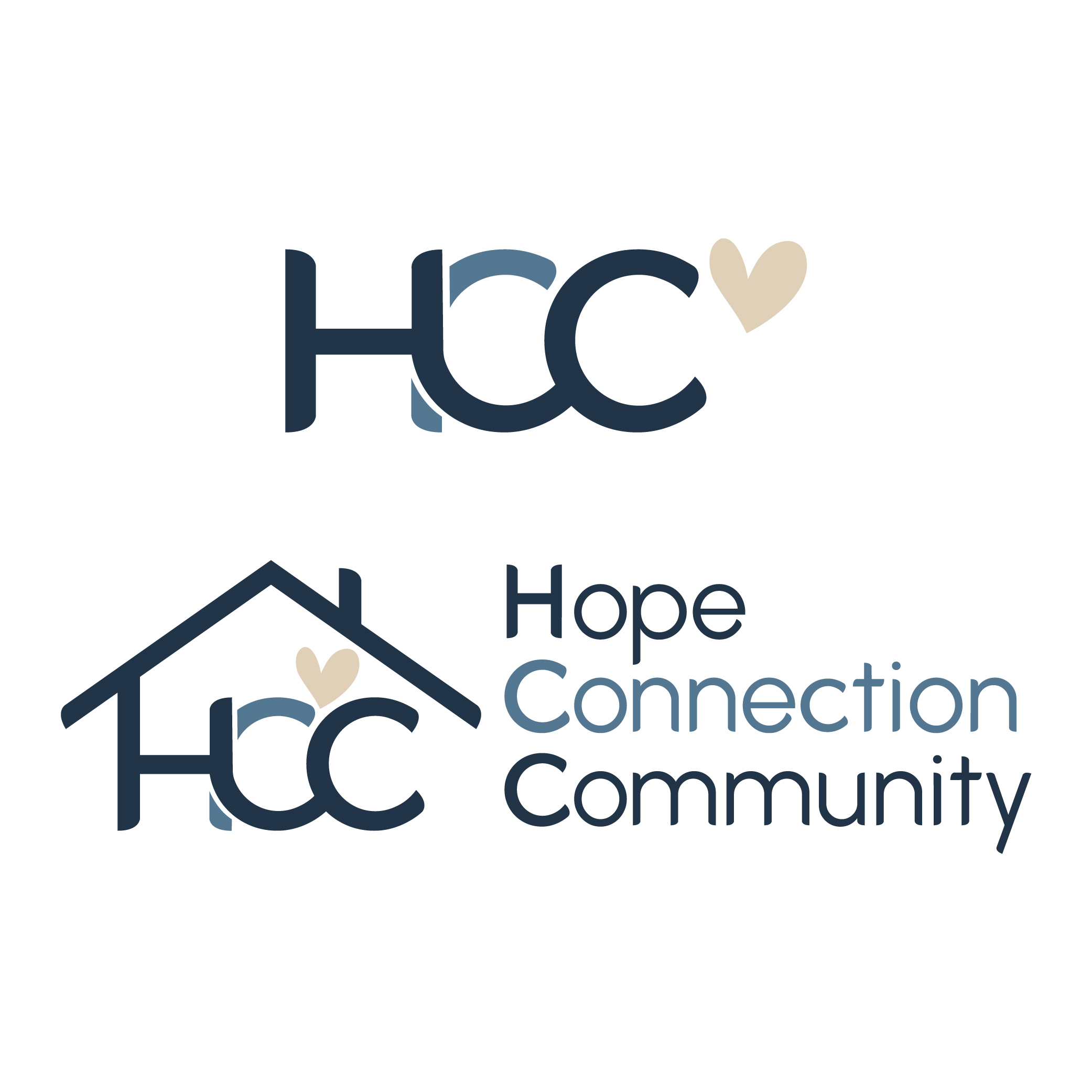
Hope Connection Community
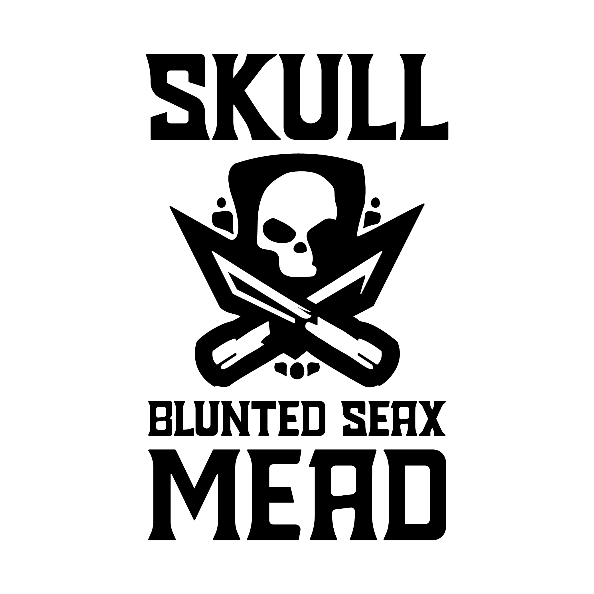
Skull Blunted Seax Mead

GHS MTB
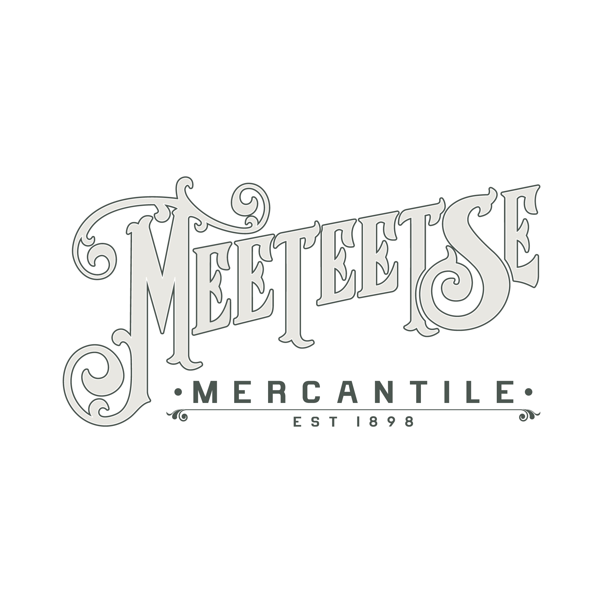
Meeteetse Mercantile
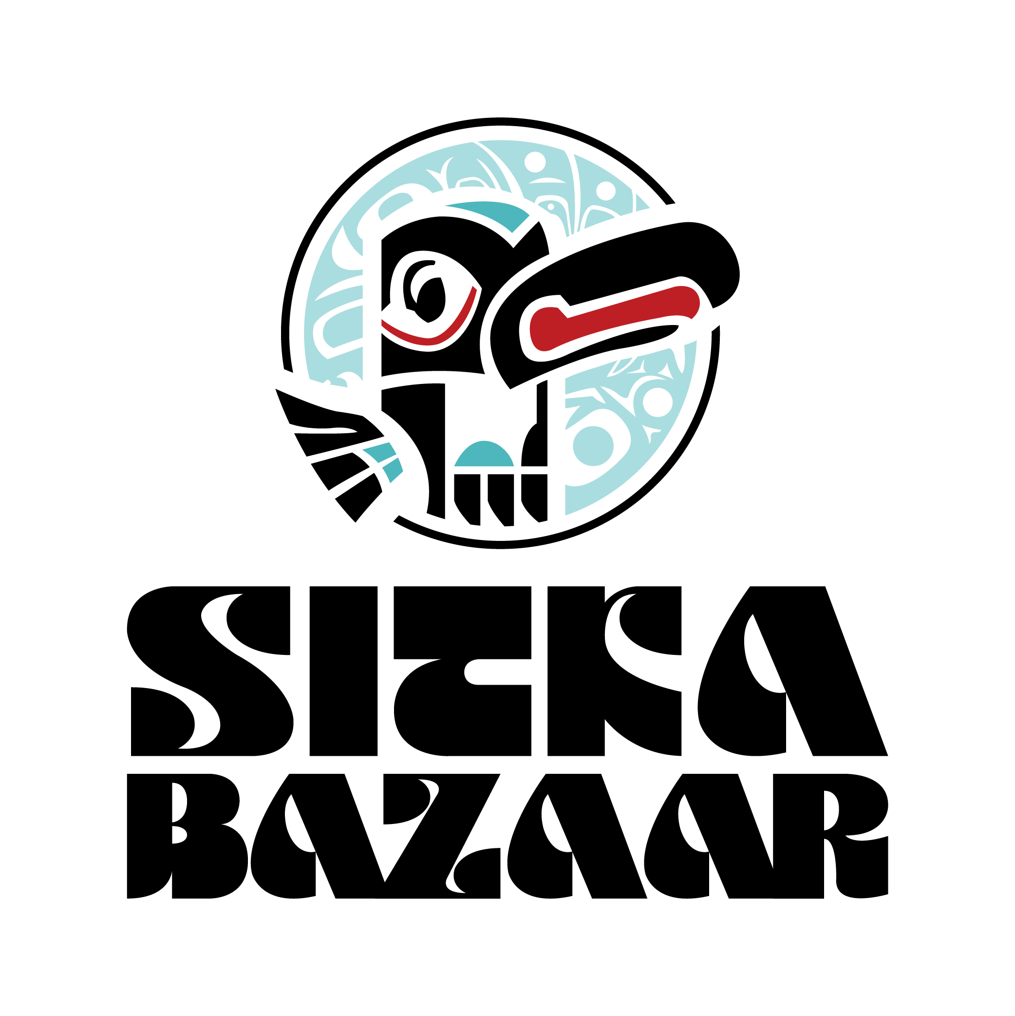
Sitka Bazaar
Vic Payne Studio
Sitka By The Sea
MacLeran & Vaughan

Wildflour Bakery & Coffee
Horse Thief Wine